Learning Studio / author
Write with blocks
Combine editable text, layouts, media, panels, and activities.
Build a page from blocks: individual pieces of text, media, layout, or activity that you can select and edit.
Add and edit
Section titled “Add and edit”Choose a block type, select it on the canvas, and adjust its properties in the inspector. Rich text supports headings, lists, links, quotes, and formatting, and stays editable.
Content types include text, callouts, columns, images, video, audio, downloads, objectives, rubrics, separators, panels, quizzes, checklists, image hotspots, reflections, choice scales, embeds, and copyable prompts. To show a rubric, see Write rubrics for scored work. Check the add controls in your build for the available types.
Choose each block for a purpose. For example, use text to explain an idea and a question to give learners a chance to apply it.
For a focused AI edit, select a block and open the inspector’s AI Assist tab or toolbar AI control. Review the proposed changes before choosing Apply. See AI Assist.
Nesting boundaries
Section titled “Nesting boundaries”Use columns to place blocks inside a layout. Panel items contain titled rich text, and accordion items can include one level of tabs. Other panel items don’t support arbitrary nested blocks.
Decorative content
Section titled “Decorative content”Separators are decorative dividers. The required/decorative setting describes the content’s role; it doesn’t create a completion requirement. Only scored quizzes in ordered navigation can block progress.
Reuse a composition
Section titled “Reuse a composition”Save a block as a template to insert independent copies later. See Reuse blocks and pages.
Inline panel editing
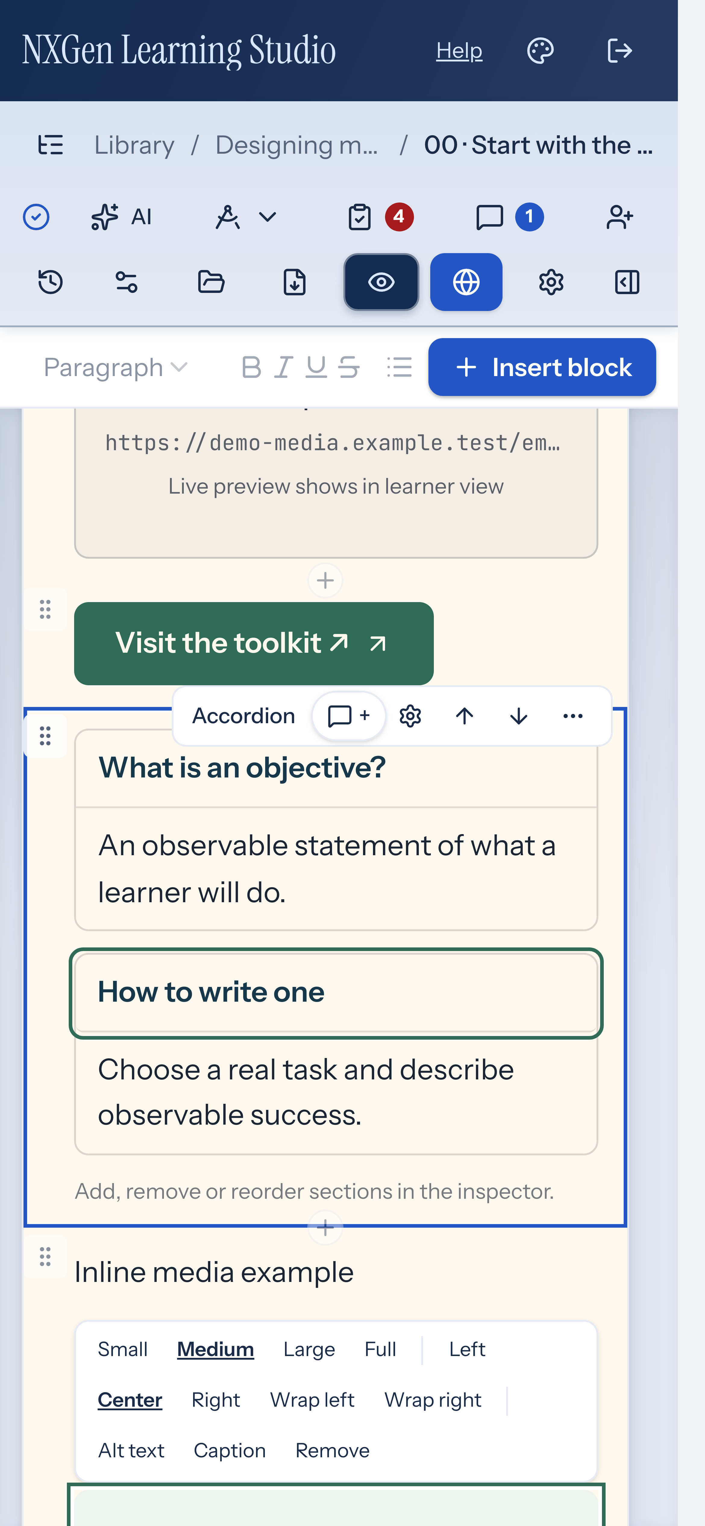
Section titled “Inline panel editing”When you select an accordion or tabs block on the canvas, every item opens for editing directly inline. Click a section or tab title to type a new name, and click the rich-text area beneath it to edit content. Use the inspector to add, remove, or reorder items; the canvas handles titles and text.
Reorder blocks on a page
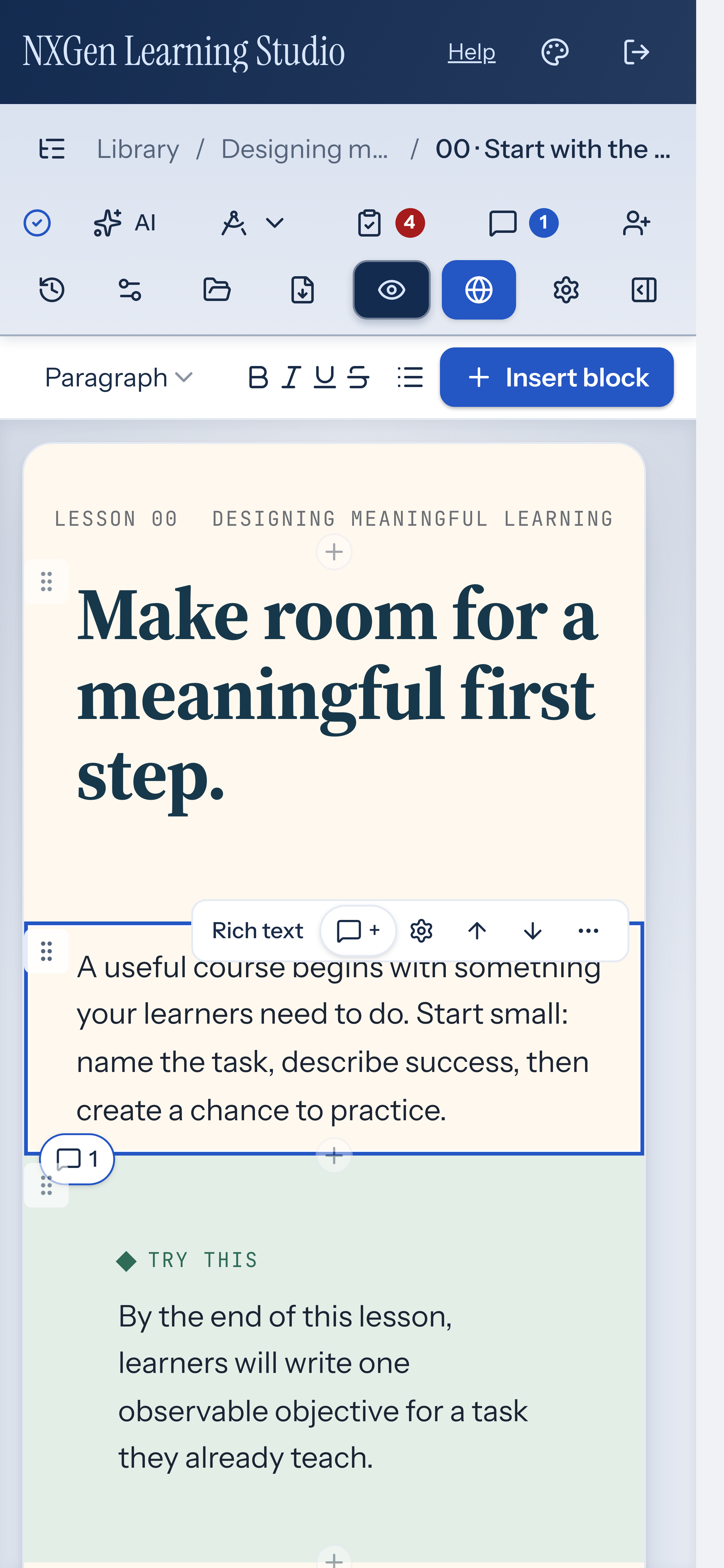
Section titled “Reorder blocks on a page”Select a block on the canvas. Use the Move up or Move down button in the block toolbar to change its position. The move buttons are disabled when a block is locked or already at the top or bottom of its container.
Duplicate a block
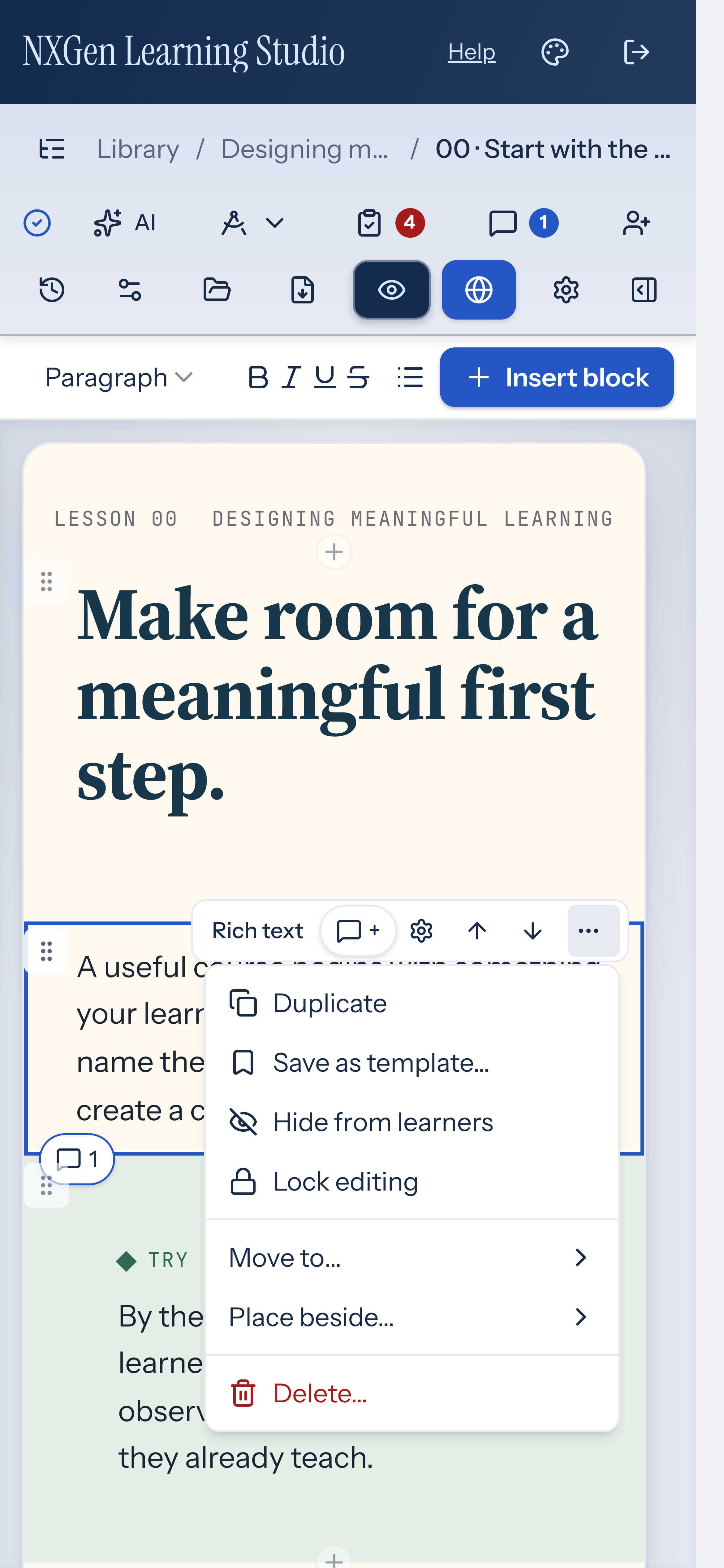
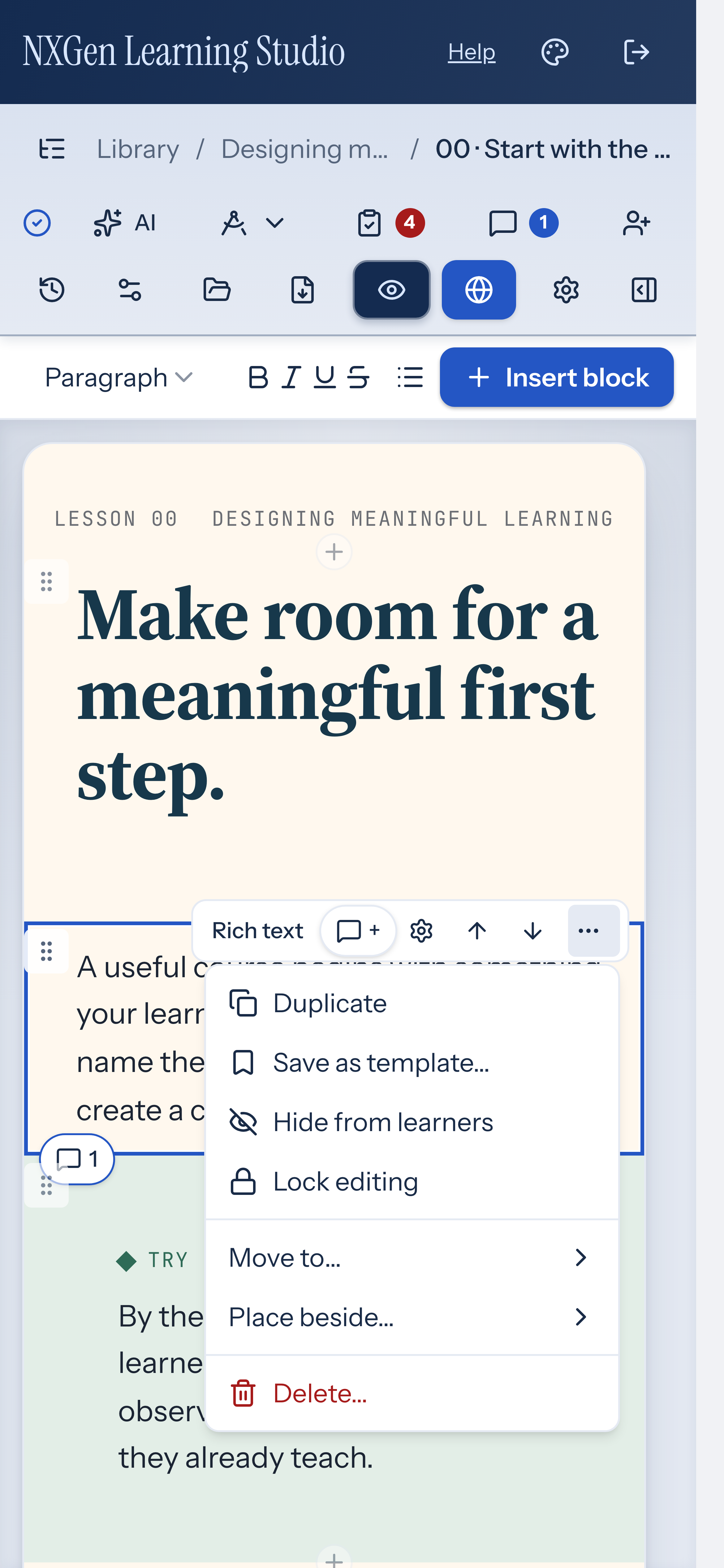
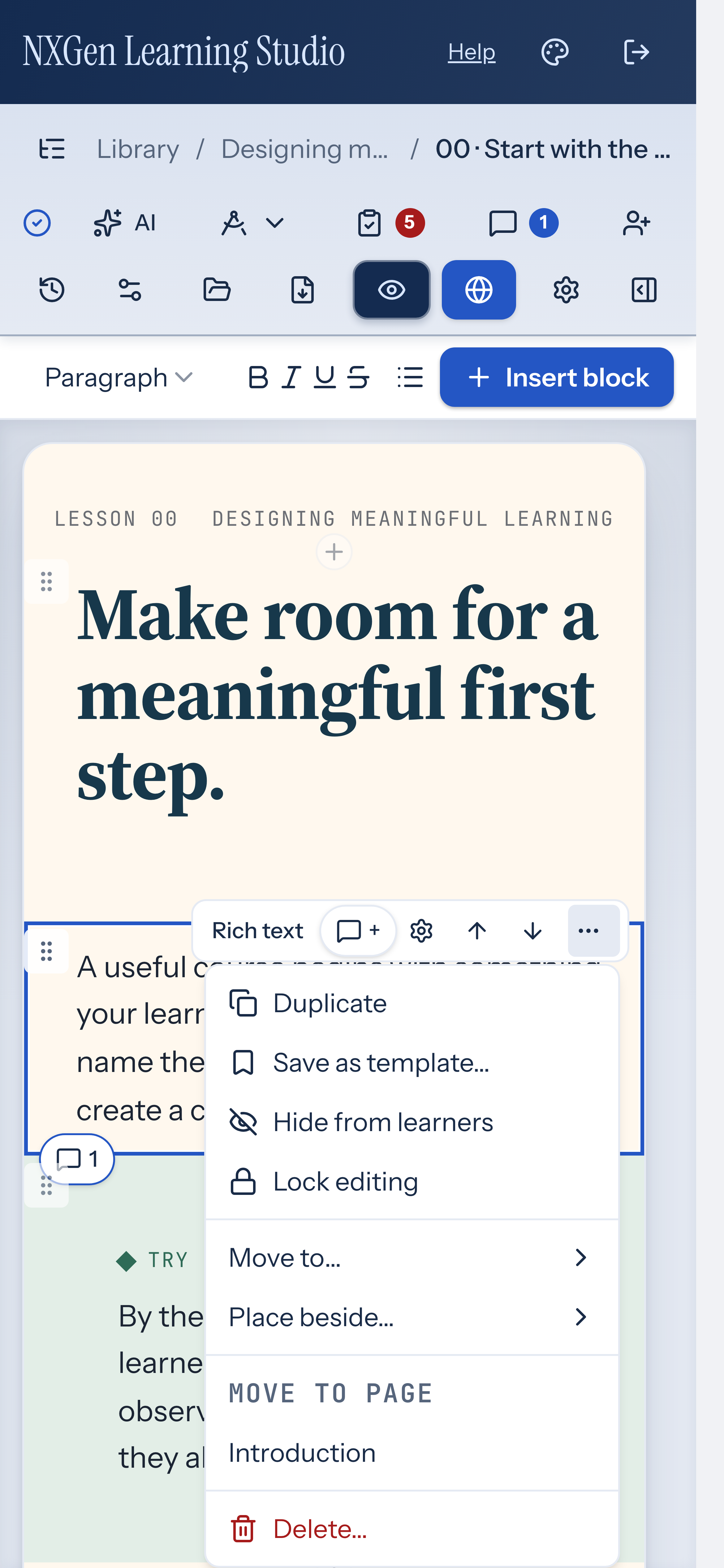
Section titled “Duplicate a block”Select a block on the canvas and open its More actions menu (the ⋯ button). Choose Duplicate to insert a copy of the block directly below the original. The copy is selected automatically.
Lock or unlock a block
Section titled “Lock or unlock a block”Select a block on the canvas and open its More actions menu (the ⋯ button). Choose Lock editing to prevent changes to the block, or Unlock editing to allow them. You can also toggle the Lock editing switch in the inspector’s Behavior group.
Configure embed blocks
Section titled “Configure embed blocks”Add an embed block to include external content on a page.
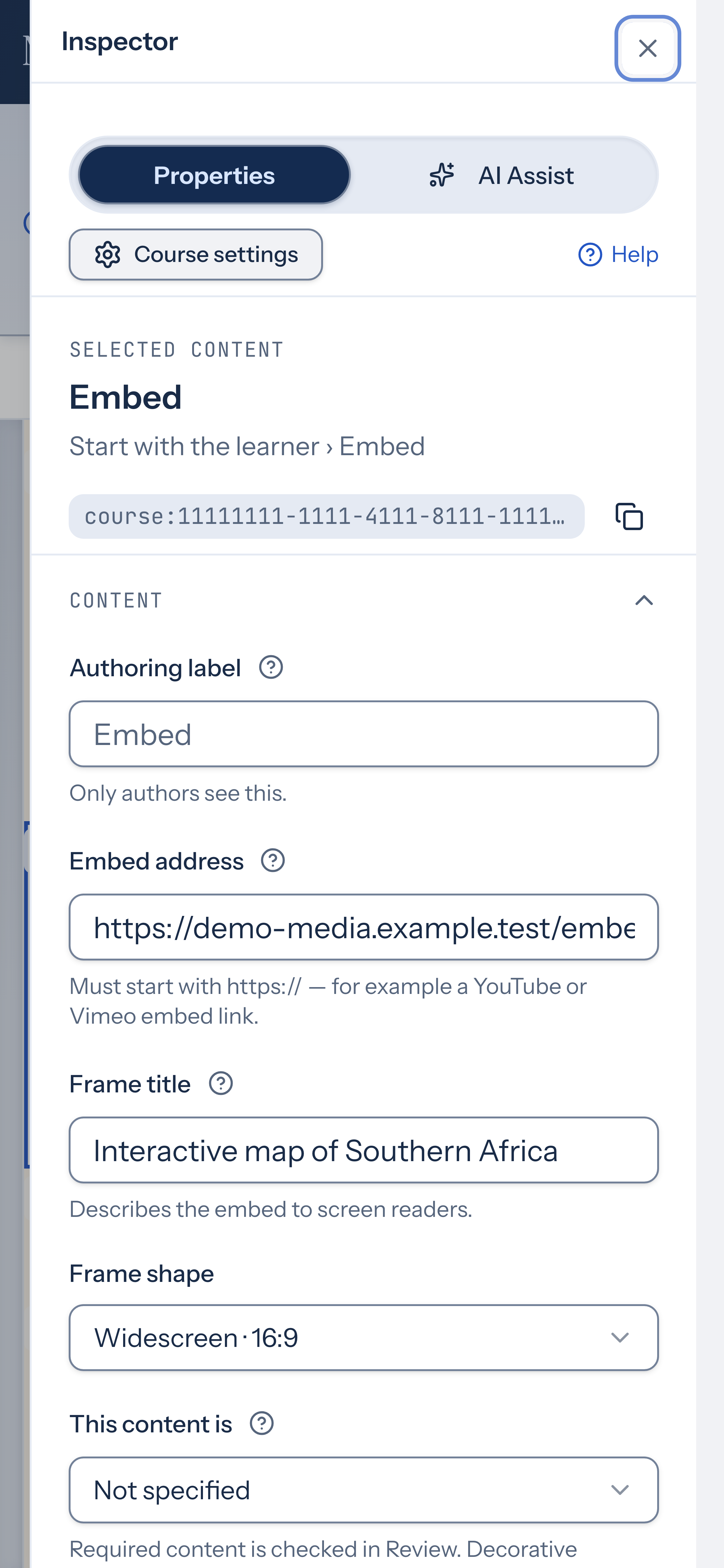
In the inspector, paste an Embed address that starts with https:// — for example, a YouTube or Vimeo embed link. Alternatively, paste Embed code (inline HTML, up to 120,000 characters). The code runs in an isolated frame: scripts work, but the frame can never reach the app, its storage, or its session.
Set a Frame title so screen readers can describe the embed. Choose a Frame shape (16:9, 4:3, or 1:1) for the embed’s aspect ratio. If you need a specific size instead, set a Height between 40 and 4000 pixels; this replaces the aspect ratio shape.
In the editor, URL embeds show a light preview card. The live embed frame appears in the learner view.
Move a block inside a columns layout
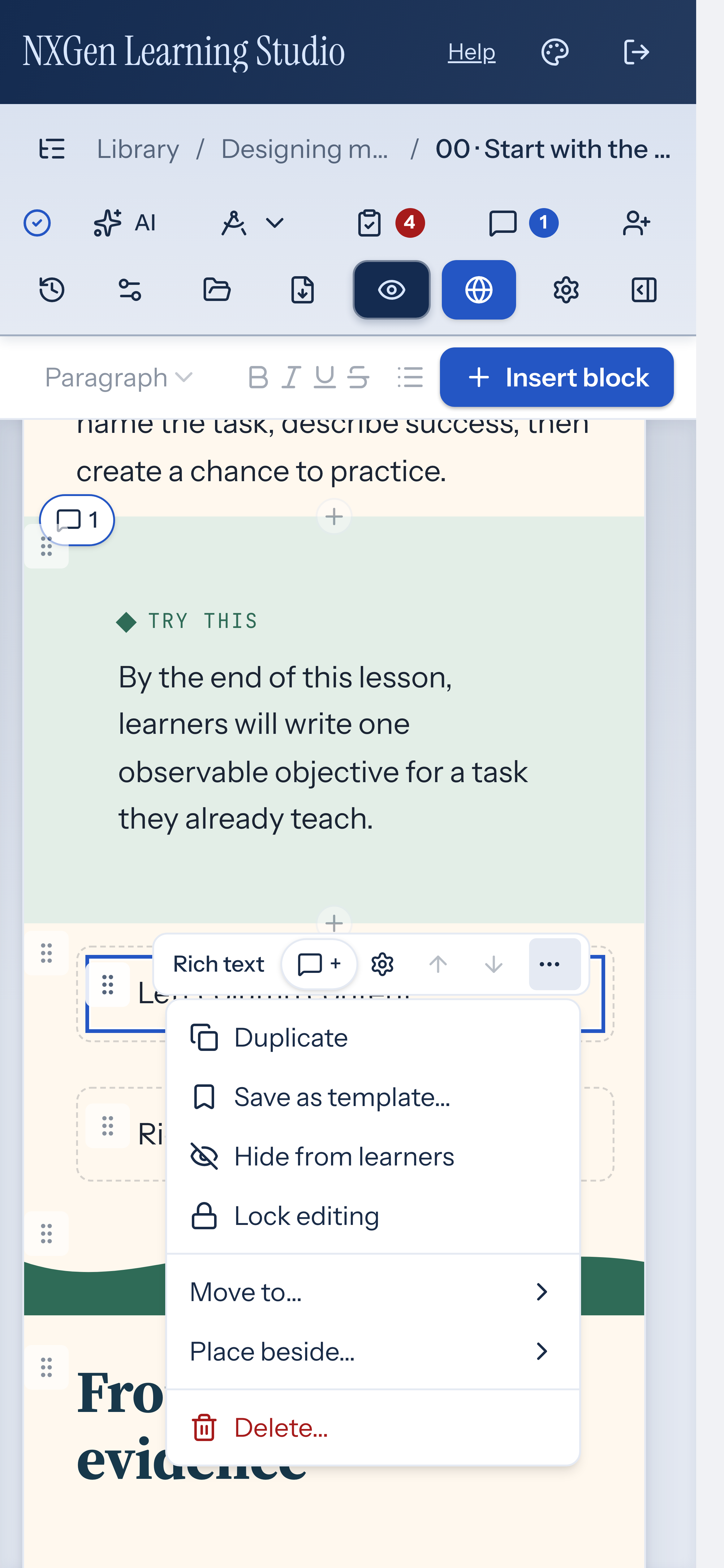
Section titled “Move a block inside a columns layout”Select a block on the canvas and open More actions (the ⋯ button), then Move to…. Choose a destination within the current page, including a position inside a column or content group. Only valid destinations appear. To place a block in an empty column, select the block and choose Move selected block here in the empty slot. You can also drag a block onto an empty column; the slot highlights while you drag over it. Locked blocks and invalid nesting cannot move. Use Undo to return the block to its previous position. Move up and Move down reorder within the current container.
Place blocks side by side
Section titled “Place blocks side by side”Select a block, open More actions, and choose Place beside…. Choose Left of or Right of another block. NXGen creates a columns row or adds a column to an existing row. You can also drag a block toward another block’s left or right edge until the Place beside indicator appears. On narrow canvases, use the menu instead of an edge drop.
The menu offers only supported combinations. Text and most supported activities fit in rows of two; images, downloads, buttons, callouts, and quotes can fit in rows of three. A mixed row follows the smaller limit. Content groups and columns cannot themselves be placed beside another block.
When you move the last block out of a column using the canvas move controls, NXGen removes the empty column where possible. A plain row left with one column becomes ordinary blocks again; a named or styled row keeps its structure. Undo restores the move and its layout changes together.
Drag blocks on the canvas
Section titled “Drag blocks on the canvas”Each block has a grip handle in the gutter to its left. Its accessible name is “Move” followed by the block name. The gutter is outside the block’s text, so the handle never covers what you’re editing. It appears when you hover over or select a block; on touch screens it appears on the selected block.
- With a pointer: drag the handle. A line shows where the block will land, labeled Move here, or Can’t drop here where it can’t go. The canvas scrolls when you drag near its edge.
- With the keyboard: focus the handle and press Enter or Space to pick the block up. Use the Up and Down arrows (or Home and End) to choose a position, Enter to drop it, or Escape to cancel.
Escape also cancels a pointer drag. A move is one edit you can undo with Ctrl/Cmd+Z. Locked blocks show a disabled handle with the hint Unlock to move.
The selected block has one selection outline on the canvas, so you can see which block the inspector is showing.
Insert blocks from the canvas
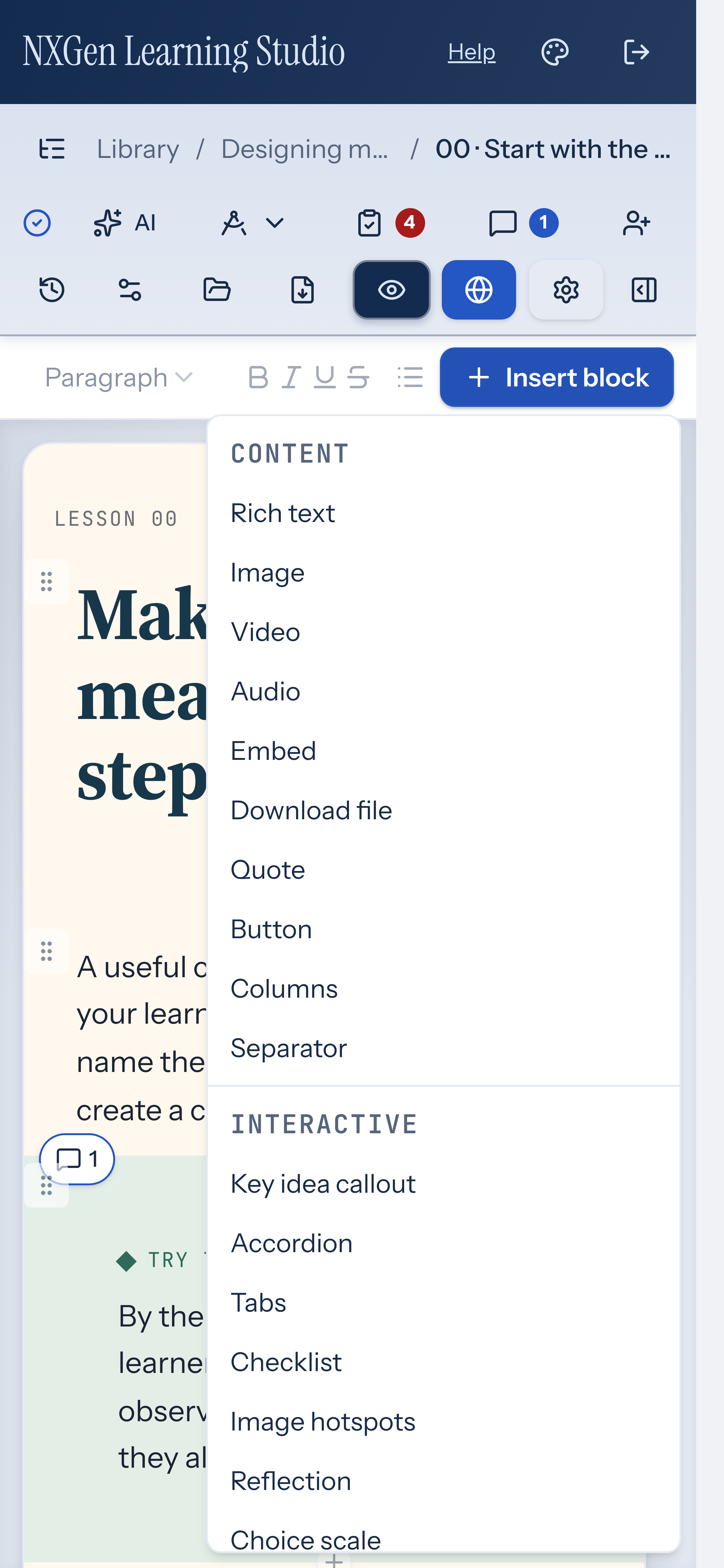
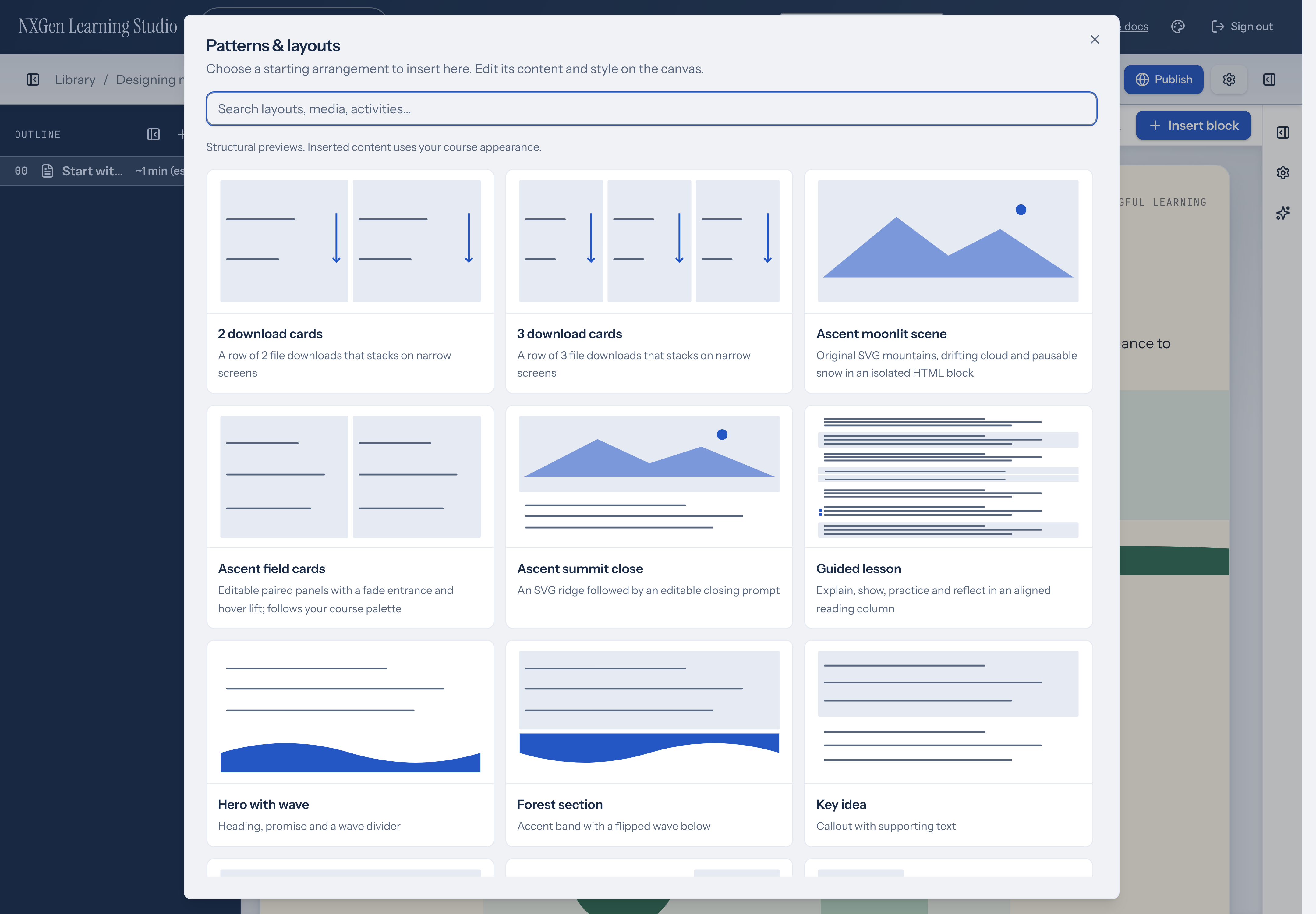
Section titled “Insert blocks from the canvas”Use the insert controls on the canvas to add content. Hover between blocks or at the top or bottom of a page to reveal the + slot, or choose Insert block from the toolbar above the canvas. The insert menu organizes block types into Content, Interactive, and Assessment groups. Choose Browse patterns & layouts for a larger searchable gallery with structural previews, or insert your own Saved templates from the menu.
Edit, move, duplicate, hide, lock, and delete blocks
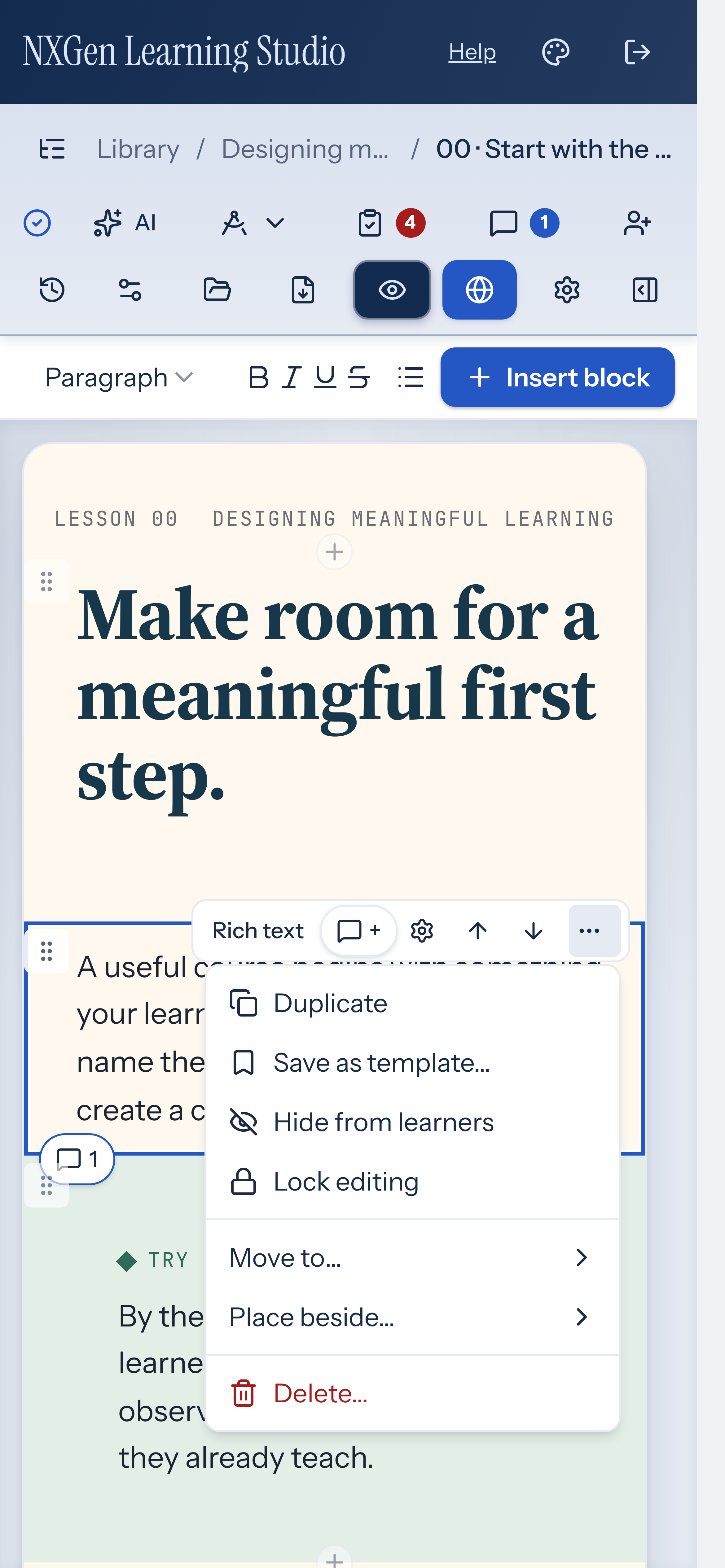
Section titled “Edit, move, duplicate, hide, lock, and delete blocks”Select a block on the canvas to see its toolbar. Use the toolbar buttons to open properties, move the block up or down, or open the More actions menu (the ⋯ button). From the More actions menu you can duplicate the block, save it as a template, toggle learner visibility, lock or unlock editing, move the block to another page, or delete it.
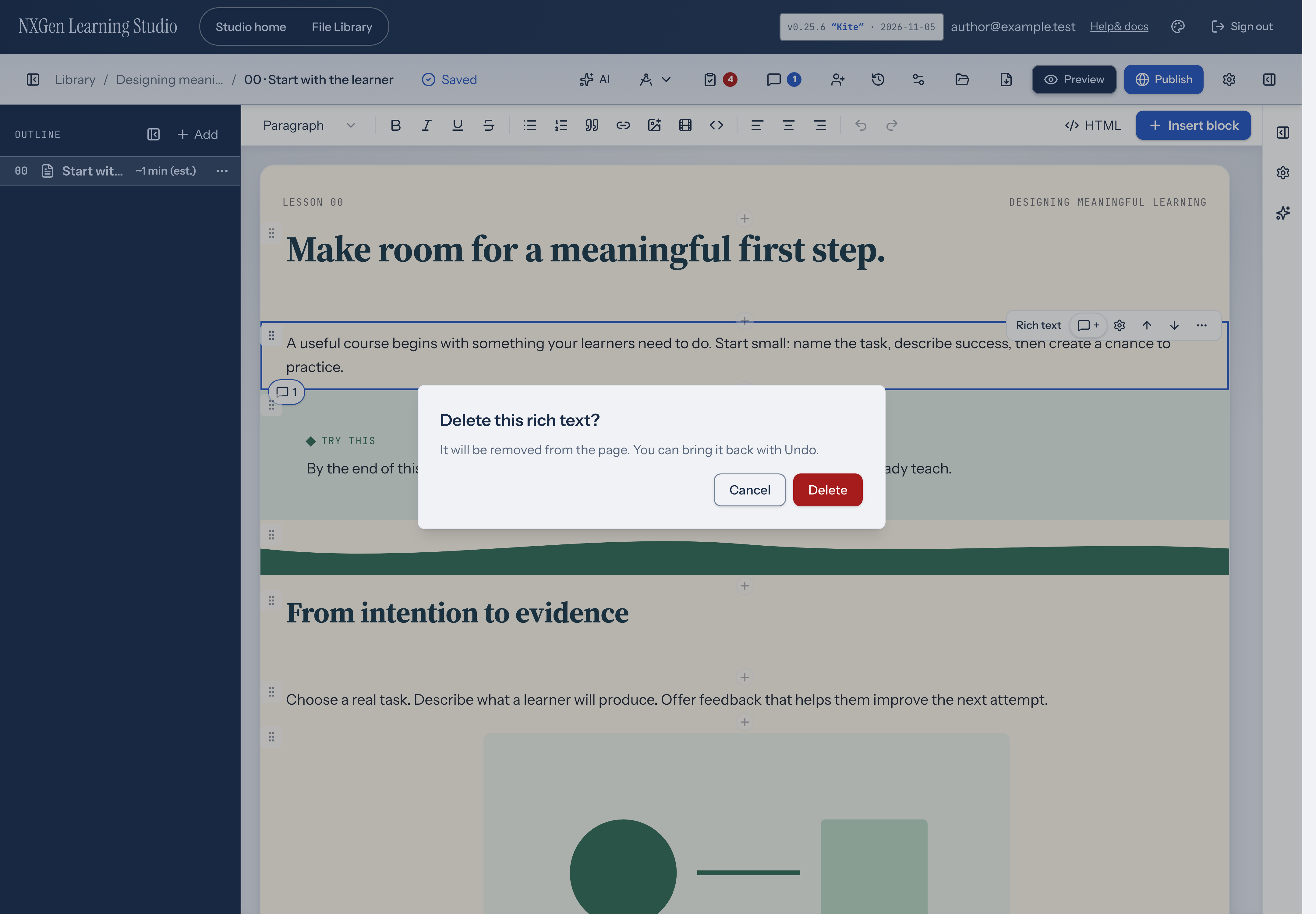
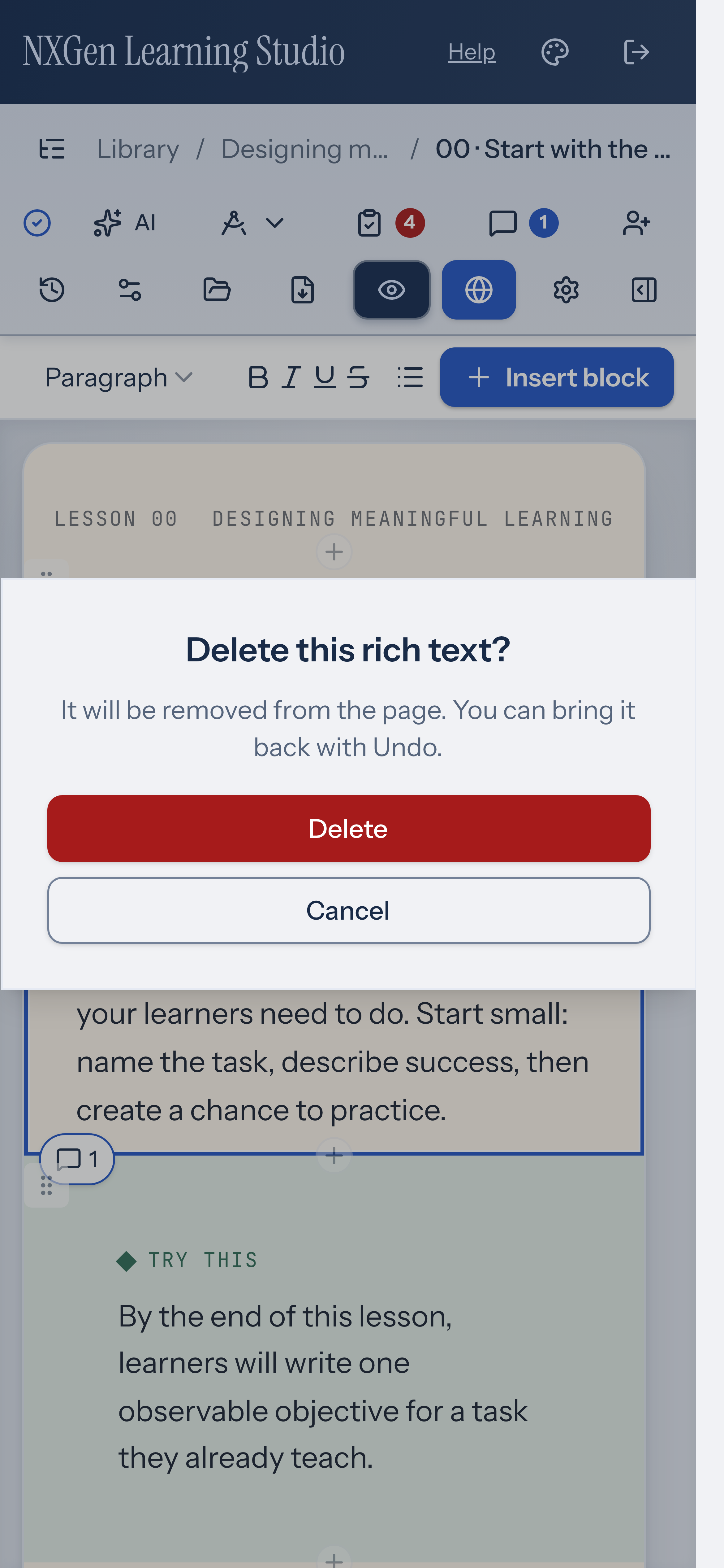
An untouched starter block deletes immediately; a block with authored content or changed settings asks for confirmation. Both can be restored with Undo.
Hidden blocks are dimmed on the canvas and skipped in the learner view. Locked blocks can’t be edited, moved, duplicated, or deleted until you unlock them.
Use a managed HTML component
Section titled “Use a managed HTML component”For a self-contained HTML/code embed, choose Enable managed component in its properties. This is an optional conversion; ordinary URL and HTML embeds remain available. Conversion follows the normal course operations and can be undone.
The first component profile supports inline HTML, CSS, classic scripts, SVG, and attached image, font, audio, or video assets. Edit the source and use Apply source to apply it. Give the frame a descriptive title. Choose automatic or fixed height, and whether the component preserves its own theme or receives course color tokens.
Use Attach component asset to add a private file. Reference the returned nxgen-asset: token in the source. A component can have up to 32 assets, 5 MiB per asset and 10 MiB in total; source is limited to 120,000 characters. If a file’s bytes change, the component reports an integrity error. Attach the new version and update its source token to accept it. Detaching an unused binding does not delete the file.
On the canvas, choose Interact to use the component, then Edit block or Escape to return to editing. Preview runs the same component renderer. The frame is isolated from your account, app storage, and trusted grading controls.
This profile is for self-contained components. External scripts and stylesheets, modules, forms, nested frames, relative-file packages, and network services are unsupported. The component editor does not import arbitrary ZIPs or provide persistent learner state. Supported components can travel inside a native course package. Older readers do not support managed component descriptors; use a compatible current build to open these courses.
Choose a native practice activity
Section titled “Choose a native practice activity”Use Image hotspots to explain parts of an image, Reflection for private written responses, or Choice scale for readiness and next-step feedback. Reflections and choice selections last only while the page is open; they are not submitted or saved. None of these activities gates progress.
Move a block into an empty content group
Section titled “Move a block into an empty content group”Select an unlocked block outside an empty content group, then choose Move selected block here in the Empty group area. You can also drag the block into that area by its handle, or use + to add new content. The group must be unlocked and the block must be allowed inside it. Undo restores the block to its previous position.