Learning Studio / author
Shape layouts and themes
Separate workspace appearance from the course your learners see.
Style your course for learners, then check how it reads at different screen sizes. Course appearance is separate from your app workspace theme.
Course appearance
Section titled “Course appearance”Open Course settings and locate the Course appearance group. Course colors stay the same when you switch workspace appearance in the app.
Choose a Harbor, Grove, or Ember palette in Light or Dark, or apply an Aster Light or Aster Dark appearance. For coordinated colors and a soft violet background glow, choose Aster Light or Aster Dark — these appearances apply to every course page and replace any background image, while preserving fonts and spacing. See Build a page with Aster for the appearance and gradient options.
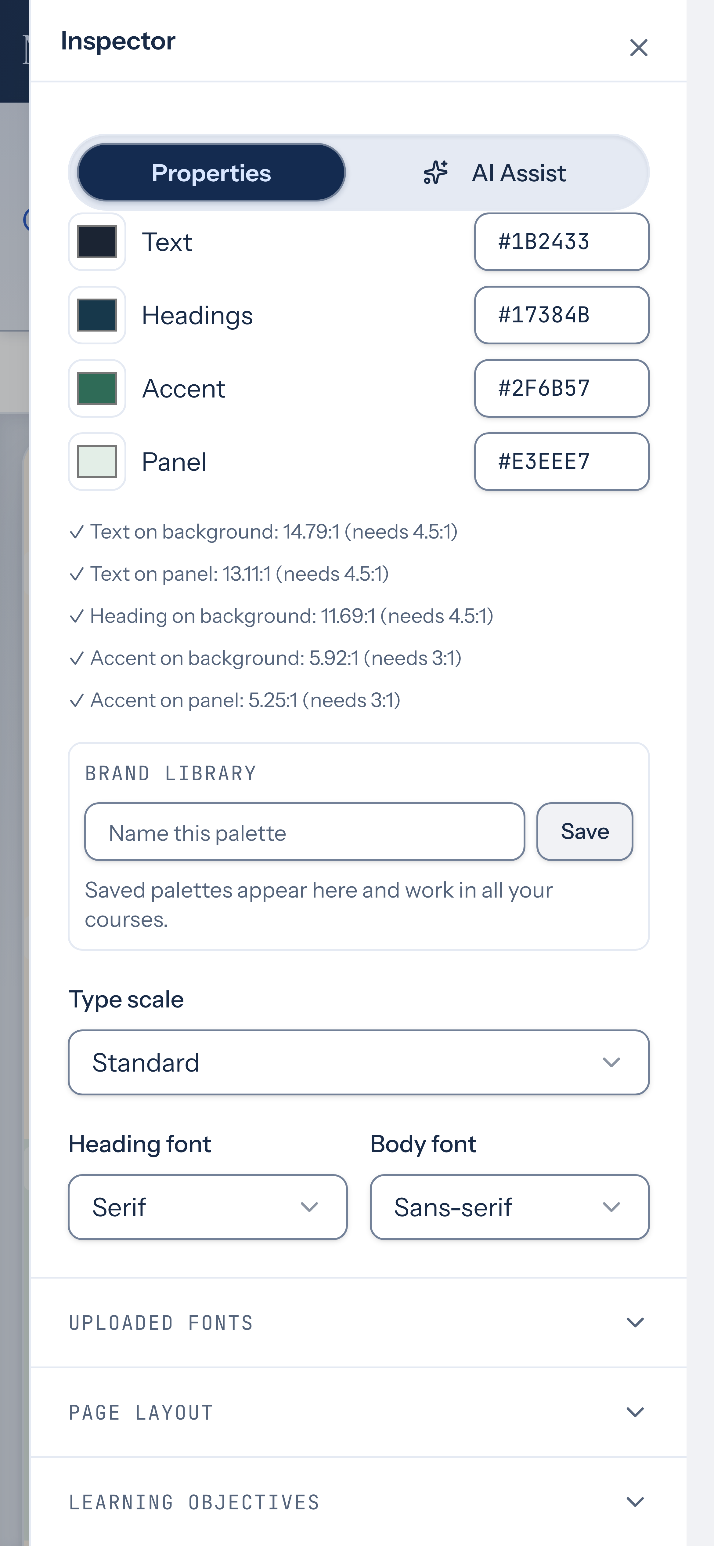
Edit individual colors by entering HEX values or using the color pickers. Palette contrast checks help identify readable combinations; saved brand palettes belong to your account. Check your actual course colors and content after applying a preset. Set the Type scale to Compact, Standard, or Large, and choose the Heading font and Body font. In Uploaded fonts, upload a custom font or use Choose existing file to reuse a supported font from Course Files or Files Library, then select it for headings or body text.
Page and block layout
Section titled “Page and block layout”Open Course settings → Page layout to set the background, content width, and spacing between blocks for every course page. Apply reading layout gives standard blocks a focused reading column and comfortable device-specific spacing; wide and full-width blocks keep their authored widths. For a background image, Choose existing file reuses an image from Course Files or Files Library; Search existing files finds it by filename. Reused files share the same resource, so replacing one updates every place it is used. Select a block to adjust its width, padding, background, and supported layout options. Use columns for content that belongs side by side. A new columns block starts at Standard width, like other blocks; choose Wide in its width setting to widen it.
Patterns and layouts gallery
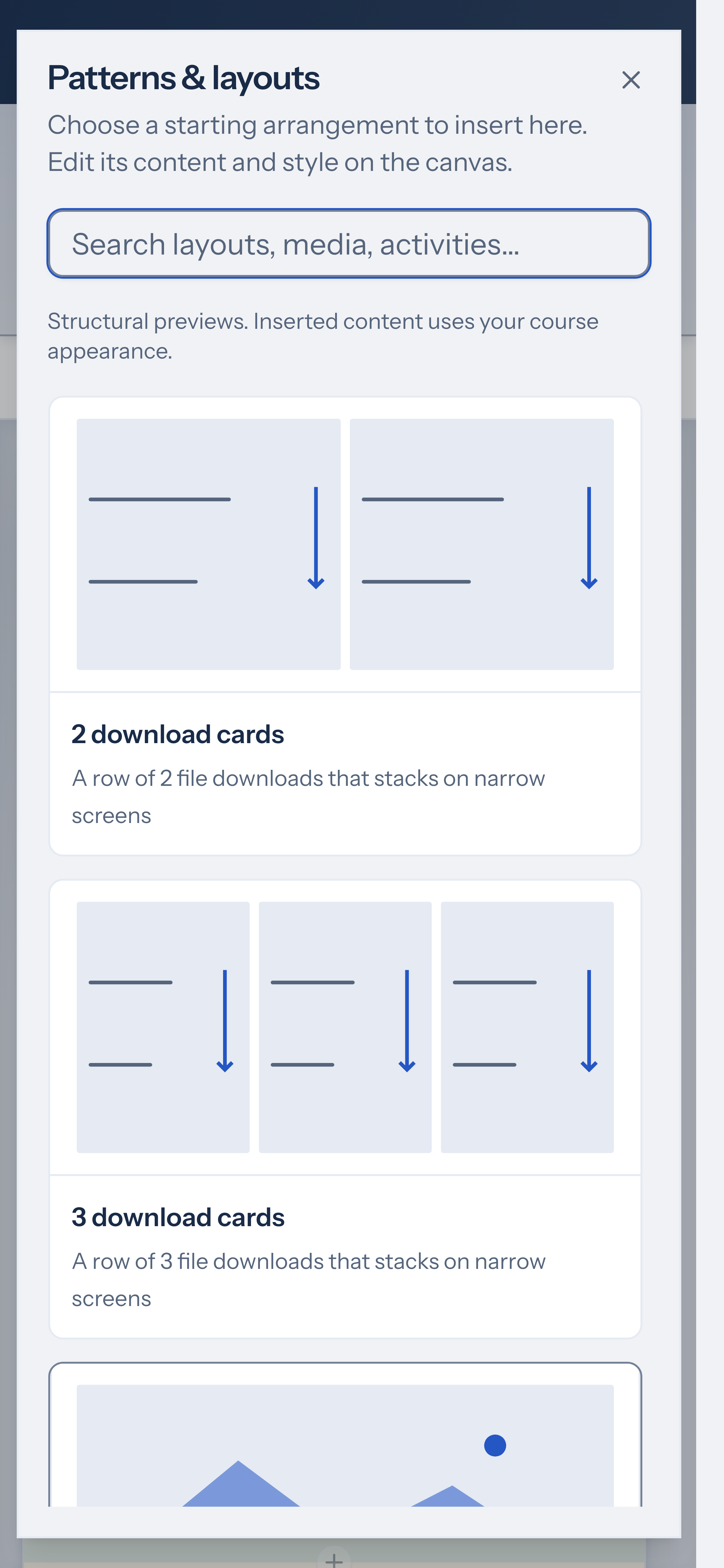
Section titled “Patterns and layouts gallery”Ready-made arrangements live in the Patterns & layouts gallery, not as a long list inside Insert block. Open the Insert block menu on the canvas toolbar or between blocks, then choose Browse patterns & layouts. The Patterns & layouts dialog shows structural previews; inserted blocks use your course appearance. Use the search field (Search layouts, media, activities…) to filter cards such as Guided lesson, 2 download cards, or 3 download cards, then edit the result on the canvas like any other content. See Insert starter patterns onto a page for the full pattern set and editing workflow.
Move blocks into empty columns
Section titled “Move blocks into empty columns”When a column has no blocks, the canvas shows an Empty column target. Drag an unlocked block by its grip handle into that column (see Drag blocks on the canvas), or select a block elsewhere and choose Move selected block here. Undo restores the previous position. Locked blocks and invalid targets show an error instead of moving.
Enable Developer Mode in the Optional advanced tools card in Preferences for additional spacing, border, effects, transform, and text controls on selected blocks. This preference applies in this browser. Turning it off hides the extra controls while keeping existing block styles.
Device overrides
Section titled “Device overrides”You can override the desktop layout for phone and tablet at both the page level and the block level. Page-level overrides adjust content width and block spacing; block-level overrides adjust content width, spacing, background, rotation, and overlap for an individual block. In both cases the content stays the same — only the layout values change for that screen size.
For page-level overrides, select the device in the page layout controls. For block-level overrides, select a block in the inspector and locate the Per-device layout section, then turn on Phone overrides or Tablet overrides with the toggle for that device.
For block overrides, the panel starts from inherited desktop values. Page layout uses a different fallback: phone values inherit tablet settings, then desktop settings, when no override is set. Change only the properties that need a different value. Reset to desktop clears the selected device’s overrides; in page layout, a phone may still inherit a tablet value. Check the result in Preview at each size.
Block animation controls
Section titled “Block animation controls”Select a block and open the Animation group in the inspector. Apply a Motion presets option as a starting point, then adjust its timing. Choose an Entrance effect, then set Easing, Duration (100–5000 ms), and Delay (0–5000 ms). Add an On hover effect or Loop emphasis if needed. Toggle Play every time it scrolls in to repeat the entrance on each scroll into view, and Stagger items to animate children sequentially. Choose Preview actual block to inspect your content at phone, tablet, or desktop width, or Play for a quick timing sample. See Configure block animations. Animations play in Preview and for learners. The course respects the learner’s reduced-motion preference.
Verify
Section titled “Verify”Open Preview and inspect desktop, tablet, and phone sizes. Check that long headings, columns, and interactive content remain readable and usable. Preview uses the same content rendering as the editor. In Preview and in published or exported courses, each page shows its title as the page heading. The title is left out on cover pages, and when the page’s first block is already a heading with the same text.